7 Designers Share Their Favorite Paint Colors for a Relaxing Home
At Apartment Therapy, we believe that your home is your sanctuary—and you should treat it as such. After all, where else can you retreat to after a long day at work, bad date, or busy vacation and just relax?
But before you KonMari your space or invest in some soft, dreamy sheets for your bedroom, you should decide on your home's color scheme.
Everything from the backsplash in your kitchen, to the tint of your floors, to, yes, the paint color for your walls has the power to set the mood of your space and dictate how you should decorate it.
Since very few people feel totally at home with a busy wallpaper or neon hue, we asked seven designers for their favorite calming paint shades.
A Soft White

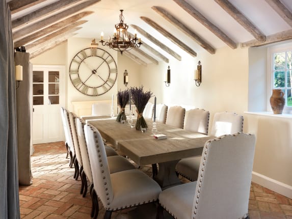
"We love Farrow & Ball paint. They are highly pigmented paints that deliver a unique depth of color; you can literally stare at the wall and get lost. Their subtle neutrals, muted pastels, and rich dark hues are all so relaxing to the eye—especially Cornforth White. We catch ourselves using that color a lot!" —Xandro Aventajado, co-founder and creative director of Current Interiors
"I love working with Farrow & Ball because their paints seem to have a calming effect regardless of the color—off-black is one of my favorites! Cornforth Whiteis also great for when you want to add some drama in a soft way." —Jessica Schuster, interior designer
Subtle Brights
"My most relaxing paint colors aren't the most obvious choices, but combining them with a soothing palette really creates a calming vibe. I love Bright Yellow, Peachy Keen, and Early Spring Green from Benjamin Moore." —Ghislaine Viñas,interior designer
50 Shades of Grey

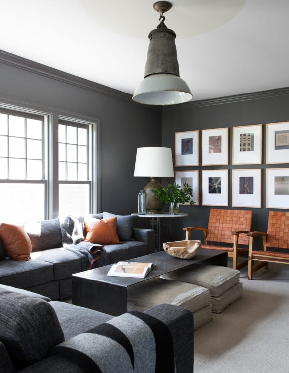
"Kendall Charcoal from Benjamin Moore—or Kendall, as our office lovingly refers to it—has become a favorite. It's smokey and inky at the same time. The darkness and richness of the chroma remind us of a great cashmere sweater: You just want to snuggle in with a good book—and what's more relaxing than that?! We love it in a room with plaids, saddle leathers, and some great textures. We've [also] used it on flat walls, stucco walls, and even brick; the more texture, the more drama and depth this intriguing color has." —Dan Mazzarini, owner and creative director of BHDM
Double Duty

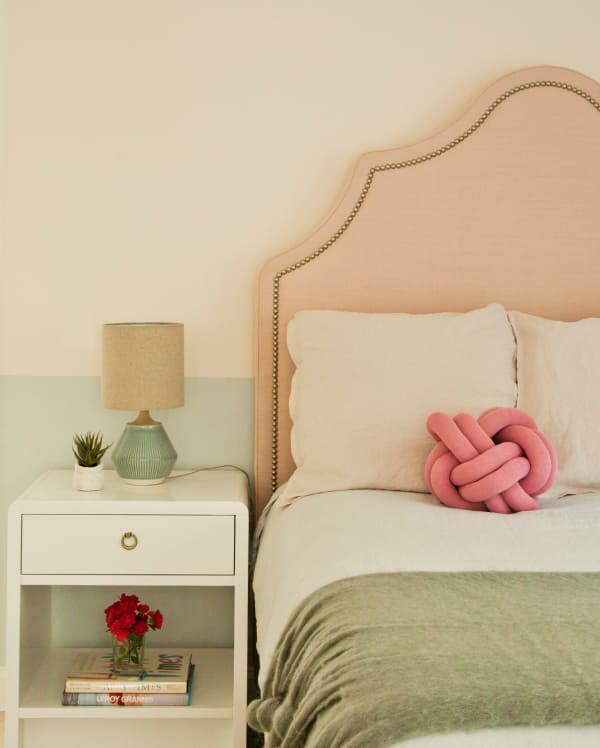
"I design a lot of beach homes and find it's nice to get away from the traditional soft blues that are so often used to evoke a calm space. I love to use Benjamin Moore's Iced Cube Silver and Ecru. The combination is neither too feminine nor too masculine, but a lovely marriage of the two. It doesn't feel overdone or like it's making a statement, yet offers the perfect middle ground you may not be able to achieve with just one shade of paint." —Susan Petrie, owner of Petrie Point Designs
Rolling Tones
"I believe it is the tone of the color—not only the color—that can be relaxing. It's possible to take your favorite color and select a calming, restorative tone. My favorites from Sherwin-Williams include Tidewater, Moonmist, Wishful Blue, Gratifying Green, and Pineapple Cream." —Barry Lantz, co-ownerof A Lantz Design
Au Naturale

"'I love to use neutral paint colors with just a touch of color for a serene and peaceful backdrop. Farrow & Ball's Elephant's Breath is a personal favorite. In different lights and at different times of the day, it has a subtle warmth and depth [you can't find] in other light gray paints." —Katharine Pooley, interior designer
No comments:
Post a Comment